
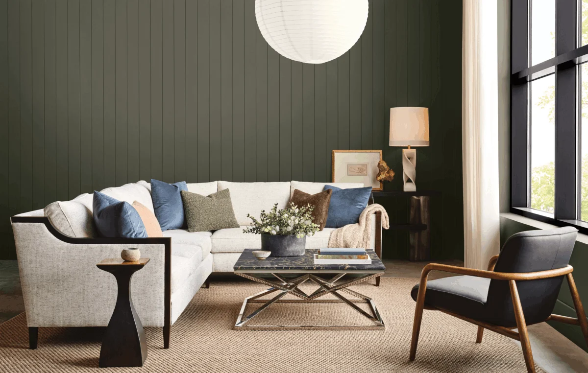
The transformative power of paint, long recognized as the most accessible and low-commitment method for injecting personality into a living space, is being redefined by Sherwin-Williams’ highly anticipated Colormix 2027 Trend Forecast. Moving beyond the comfort-seeking palettes of previous years, this year’s forecast signals a decisive shift towards greater confidence, embracing vibrant hues, intriguing textures, and audacious color combinations. The collection, featuring 48 distinct shades, offers a curated spectrum designed to empower homeowners and designers alike to create environments that are not just aesthetically pleasing but deeply resonant with individual identity and aspirations.
Emily Kantz, a distinguished interior designer and color strategist at Sherwin-Williams, elaborated on the evolving design landscape that informed this year’s forecast. "While previous forecasts explored ideas of comfort, balance, and connection," Kantz stated, "this year’s forecast embraces greater confidence through color, texture, and unexpected combinations. We’re seeing people create spaces that tell a story about who they are and how they want to live." This sentiment underscores a broader cultural trend towards authenticity and self-expression within the home, a sanctuary increasingly viewed as an extension of personal narrative.
A Look Back: The Evolution of Color Trends

The annual Sherwin-Williams Colormix Trend Forecast has become a significant barometer in the interior design industry, providing insights into the prevailing moods and aesthetic directions that will shape homes and commercial spaces. Historically, these forecasts have responded to societal shifts. The 2022 forecast, for instance, emphasized the desire for calm and balance in a world grappling with uncertainty. This was reflected in palettes that favored earthy tones, muted greens, and soft blues, promoting a sense of grounding and tranquility.
As society has navigated further challenges and emerged with a renewed sense of optimism and resilience, the demand for spaces that invigorate and inspire has grown. The Colormix 2027 forecast directly addresses this evolution, moving from passive comfort to active confidence. This shift is not merely about adopting brighter colors; it’s about a conscious decision to imbue living spaces with energy, joy, and a distinct sense of personal style. Kantz’s remarks highlight that the 2027 forecast is not simply a collection of trending colors but a strategic framework for intentional design.
The Colormix 2027 Palette: A Spectrum of Possibilities
The 48-shade Colormix 2027 palette is a testament to Sherwin-Williams’ commitment to offering a comprehensive and versatile range of options. It artfully balances bold, exhilarating hues with more approachable, serene tones, ensuring there is a shade to suit every level of design ambition. Among the standout vibrant selections are "Humorous Green," a nearly fluorescent shade that injects undeniable energy, and "Forward Fuchsia," a playful and daring hue that commands attention. Complementing these are more tranquil options like "Honorable Blue," a calming cerulean, and "Secret Garden," a lush, verdant green that evokes a sense of natural serenity.

Crucially, the forecast acknowledges the enduring appeal of neutrals, which are strategically integrated throughout the palette. These grounding shades serve as essential anchors, providing a sense of familiarity and ease, especially for those hesitant to fully embrace bolder colors. To further facilitate cohesive design, ten adjoining "continuity colors" have been introduced, creating a fully integrated system that allows for seamless transitions and sophisticated layering of hues. This comprehensive approach empowers designers and homeowners to experiment with color, offering a professional framework that provides both creative freedom and a sense of security.
Embracing Richer Shades: Depth and Sophistication
For those accustomed to the comforting embrace of lighter neutrals, the Colormix 2027 forecast offers a gentle yet compelling pathway to incorporating richer, more saturated colors. Kantz suggests a strategic approach: "One of the easiest ways to introduce richer color is by treating it as an accent that complements the neutrals you already love," she advises. This "accent" strategy can manifest in various forms, such as painting a kitchen island a deep, luxurious shade like "Midnight," a sophisticated plum, or highlighting built-in shelving with a warm, inviting tone. These targeted applications add significant depth and visual interest without overwhelming the existing design.
The forecast specifically highlights colors like "Midnight" and "Salty Dog," a deep navy, as ideal choices for enhancing the timeless appeal of traditional interiors. These richer shades, when used thoughtfully, can elevate the sense of established comfort and enduring style. As confidence grows, homeowners may find themselves drawn to more expansive applications, such as the concept of "color-drenching" an entire dining room in a hue like "Roycroft Bronze Green," a rich, earthy tone that creates an immersive and enveloping atmosphere. This gradual integration of bolder colors allows individuals to explore their evolving aesthetic preferences at their own pace.

The Power of Contrast: Juxtaposing Colors for Dynamic Spaces
One of the most exciting and forward-thinking aspects of the Colormix 2027 forecast is its embrace of contrasting color pairings. Kantz notes that the forecast deliberately juxtaposes grounded, familiar shades with unexpectedly vibrant and lively hues. This approach directly addresses the contemporary desire to move away from overly curated and staged interiors towards spaces that feel more authentic, relatable, and infused with personality.
The introduction of unexpected color combinations is a deliberate strategy to reflect how people are decorating today. Instead of adhering to strict color rules, contemporary design involves layering colors, materials, and finishes to craft environments that are uniquely expressive. An example of this bold juxtaposition is the pairing of the soft, pink-toned "Lotus Petal" with the striking green of "Jadite." This combination creates a dynamic tension that is both visually stimulating and deeply engaging. Kantz explains, "These work because they reflect how people are decorating today. They’re layering colors, materials, and finishes to create spaces with personality. The result feels curated, expressive, and uniquely intimate."
Further illustrating this principle, the forecast showcases a dresser painted in "Jadite" set against a wall in "High Sierra." This interplay of a vibrant jewel tone against a more subdued, natural backdrop demonstrates how contrasting colors can be used to define different zones within a room or to add a focal point that draws the eye. The forecast encourages designers and homeowners to think about color not in isolation, but in relation to other elements within the space, fostering a more holistic and dynamic approach to interior design.

Cultivating Joy Through Color: Nostalgia Meets Invigoration
While neutrals are essential for establishing a sense of calm and order, the Colormix 2027 forecast recognizes a growing desire for homes that actively inspire joy and uplift the spirit. This year’s palette intentionally includes colors that evoke a sense of nostalgia while simultaneously feeling invigorating and contemporary. Shades like "Real Red," a warm and inviting hue, and "Trinket," a cheerful mustard yellow, are designed to spark happiness and add a dose of optimism to any room. "Dutch Tile Blue," a rich and captivating shade, offers a sophisticated yet playful option that can transform a space into a vibrant sanctuary.
Kantz emphasizes the underlying philosophy guiding these choices: "We want to give people the confidence to see color as an opportunity rather than a design risk," she states. This perspective reframes the act of choosing paint colors from a potentially daunting task into an exciting creative endeavor. The forecast aims to demystify the process, providing a roadmap for individuals to explore the emotional and psychological impact of color on their living environments.
The persistent accessibility of paint as a transformative tool remains a core tenet of Sherwin-Williams’ design philosophy. "Paint remains one of the most accessible ways to transform a space," Kantz concludes, "and thoughtful color choices can completely shift how a home looks and feels." The Colormix 2027 Trend Forecast empowers individuals to harness this power, encouraging them to move beyond safe, predictable choices and embrace color as a powerful medium for self-expression, emotional well-being, and the creation of truly personal and joyful living spaces. This comprehensive collection serves not merely as a prediction of trends, but as an invitation to a more confident, creative, and intimately expressive approach to interior design.

0 Comments